

Fast as lightning
Rapier clocks at 1.5 seconds page speed for single post page benchmarks. Good for SEO, good for your visitors
Install and Go
Choose among ready made styles to set look and feel of your website without hassle
Visual Page Builder
Create professional pages easily using the included Visual Page Builder
Extensive Customization
Uniquely customize your website with the easy to use and in-depth options editor
Fast. Flexible. Responsive. Lightweight. Featured.
Use stylish Boxes in your pages and posts
Present your content in Rapier’s stylish box inserts through shortcodes. Vertical and Horizontal designs – completely customizable.
These boxes can be modified in shortcode and they are totally responsive.
Easy as pie through shortcodes
You can just insert an image through Wordpress editor, and Rapier will format the image to proper size.
You can modify any property of these boxes and make each one different by just dropping whatever properties you want in shortcode.
 This is a 50/50 Grid in a section
 This is a 50/50 Grid in a section
Rapier has a responsive and very flexible grid system. Fox example this content is in a 50% width grid, next to another 50% grid, both of which are totally responsive.
Grids allow you to arrange your content in responsive slots. These slots can be from 100% width to as small as ~%8 width and all of these can be used in combination like 20% + 80% in one row.
Any kind of content works here
You can put any kind of content and formatting into these blocks. They are perfectly responsive. The content size can be anything – the grid will adjust its height according to the content size.
For example we wrapped a good amount of text around a FontAwesome font and a H2 heading here. And floated it left.


This is a 50/50 Grid in a section
Rapier has a responsive and very flexible grid system. Fox example this content is in a 50% width grid, next to another 50% grid, both of which are totally responsive.
Grids allow you to arrange your content in responsive slots. These slots can be from 100% width to as small as ~%8 width and all of these can be used in combination like 20% + 80% in one row.
Any kind of content works here
You can put any kind of content and formatting into these blocks. They are perfectly responsive. The content size can be anything – the grid will adjust its height according to the content size.
For example we wrapped a good amount of text around a FontAwesome font and a H2 heading here. And floated it left.
Check Single Post Demo
Check the Single Post demo of Rapier – Single Post page is the most important page in a WordPress Site.
Most of your content will be on Single Post Pages.
Full Width Page Demo
Full Width pages allow you to create beautiful landing pages for your visitors.
These pages increase sign ups, conversions, sales and website authority.
See Blog Listing Demo
Listing page is the page which shows all your content. Its the default page for blogs, and its used for most content/post types.
This is a 50/50 Grid in a section
Rapier has a responsive and very flexible grid system. Fox example this content is in a 50% width grid, next to another 50% grid, both of which are totally responsive.
Grids allow you to arrange your content in responsive slots. These slots can be from 100% width to as small as ~%8 width and all of these can be used in combination like 20% + 80% in one row.
Any kind of content works here
You can put any kind of content and formatting into these blocks. They are perfectly responsive. The content size can be anything – the grid will adjust its height according to the content size.
For example we wrapped a good amount of text around a FontAwesome font and a H2 heading here. And floated it left.
Lets Randomly drop a H2 header here
We did it because we can. And the grid still looks neat. The power of grids allows us to format our content inside these elements in any way we want.
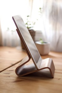 A tall image to start with. This tall image is floated left in this middle 1/3 grid element. It enlarges the grid in height.
It also keeps responsiveness and the structure of the grid. Very good for a demonstration.
Well constructed grids will also present a visually appealing composition.
On to other items
There are more elements which help fast page composition in Rapier.
By using these elements in combination like in here or specifically arranged for your own composition, you can present very appealing and easy to use pages and posts.
One such element is a Call to Action button. These are very good for alerting your visitors/users to an action they can take on your website. Rapier’s call to action buttons are totally responsive and can be formatted from admin and their shortcode.